Beyond sleezy sales tactics and surface-level engagement, we stand for empathy, authenticity, and originality.
THE MISSION
Nadja Brenneisen, full-spectrum doula & writer, outgrew her "yogamama" brand and demanded a revamp. Our mission: to shed the clichéd pastels of femininity and unleash her unique, raw feminine energy. We aimed to sharpen her digital image, showcasing her bold stance on real, unpolished motherhood.
THE OUTCOME
Blending mystical allure with scientific rigor led to the creation of a unique identity, evident in every aspect of the branding. Our central motif, the round circle, represents femininity, the womb, unity, and the solidarity of a women's circle, complemented by a sleek, bold logo and a taboo-breaking red color scheme.
THE IMPACT
Challenging traditional narratives: This new identity, anchored in Nadja Brenneisen's authentic voice, positions the brand as a powerful emblem of empowerment and raw womanhood, reshaping perceptions and celebrating the depth of motherhood with all it’s edges.
SERVICES PROVIDED
BRAND IDENTITY DESIGN
SOCIAL MEDIA DESIGN
BRAND NAMING
BRAND STRATEGY
ILLUSTRATION
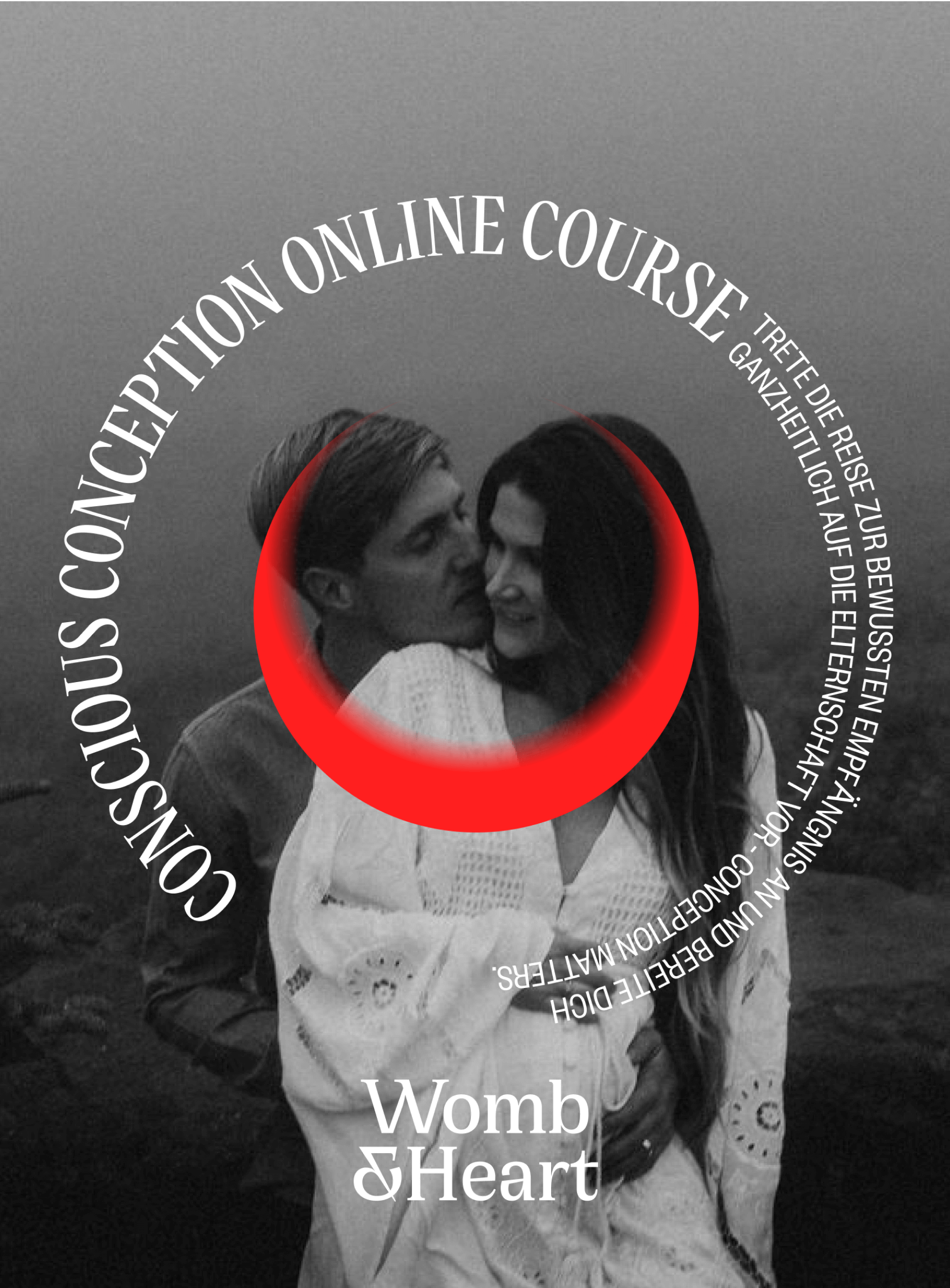
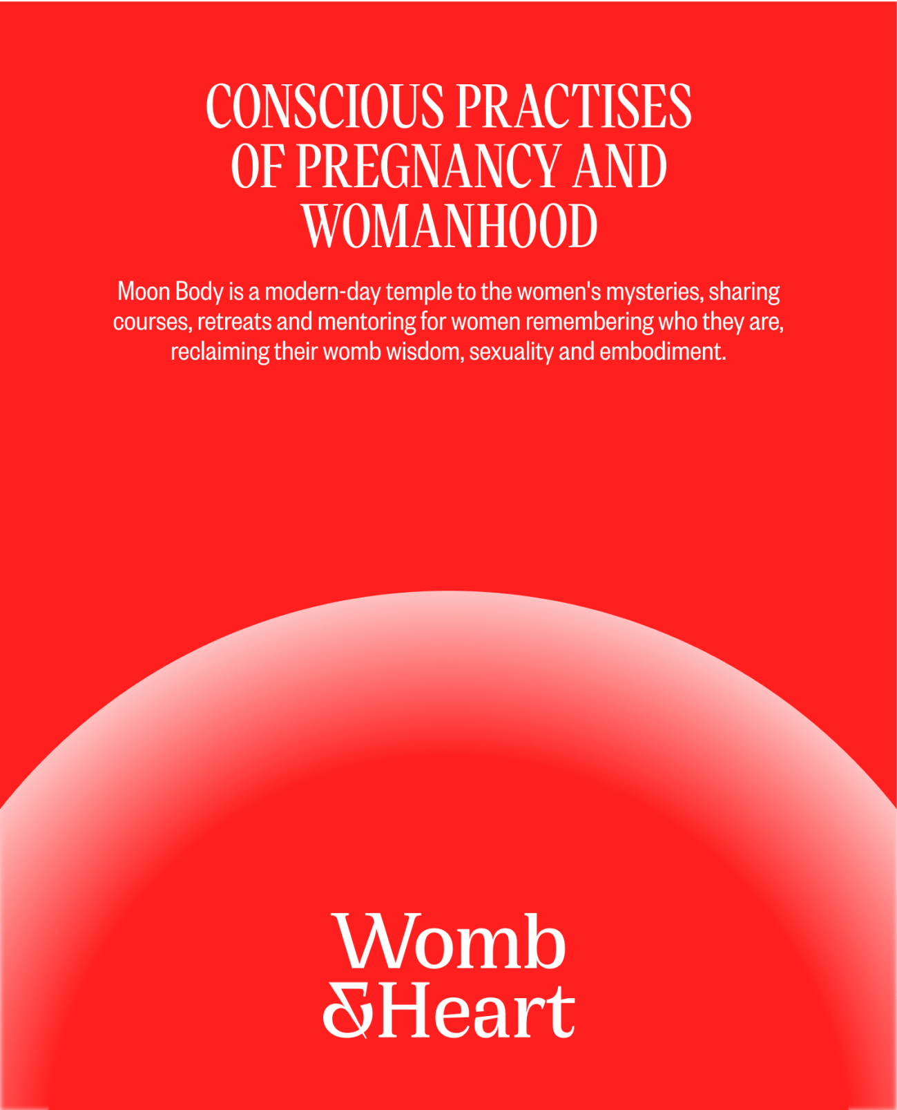
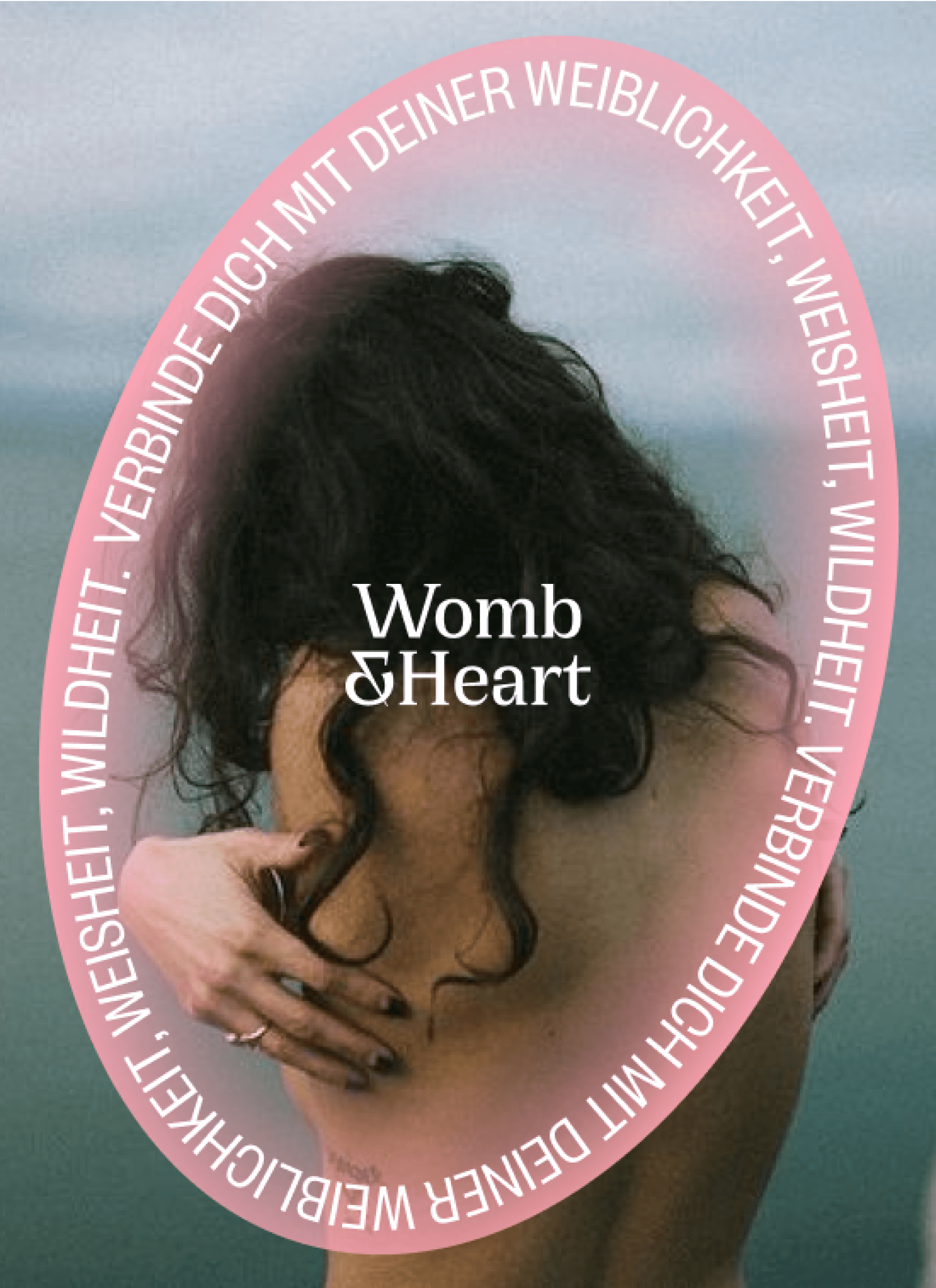
"I strongly feel that the new branding allows me to express myself better. I no longer feel confined. My inspiration flows much more freely because the branding truly resonates with me. I never imagined that good branding could have such an effect.”
Nadja
Founder, Womb&Heart
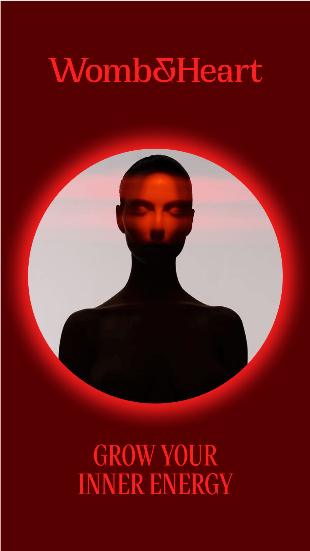
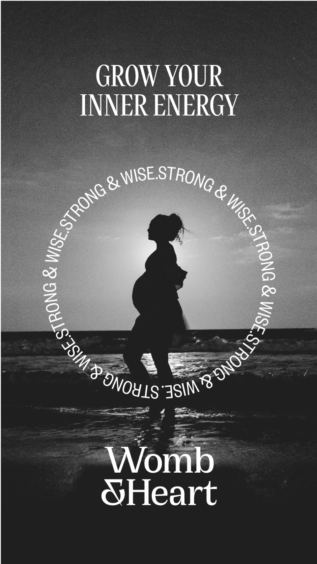
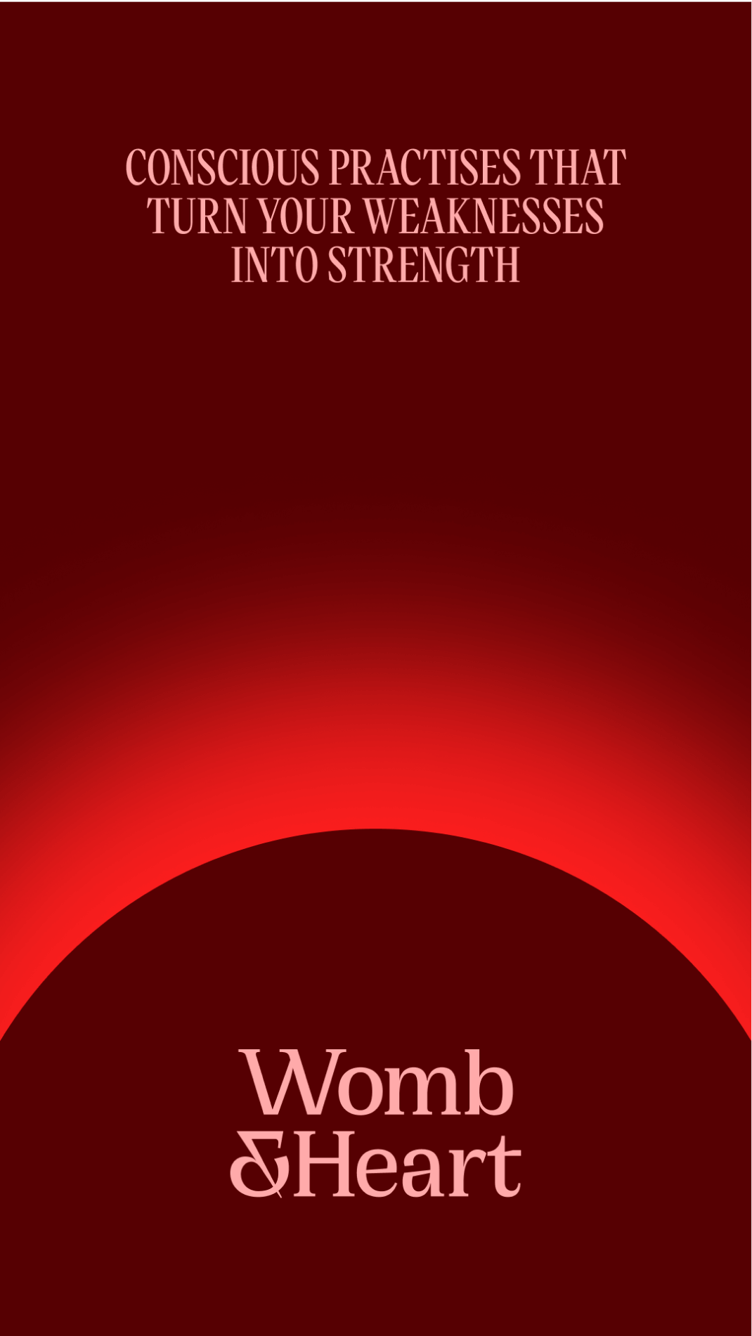

A bold departure from traditional femininity, embracing a raw and edgy representation of motherhood.

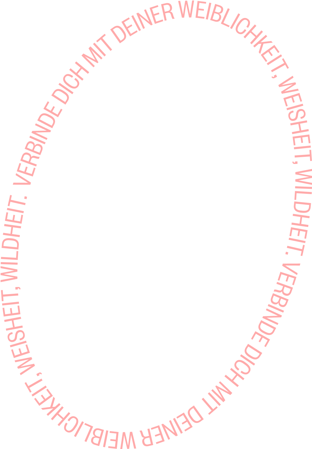

The visual elements harness the symbolic power of the circle to convey key messages, creating a continuous loop of empowerment and celebrating the cyclical nature of femininity.

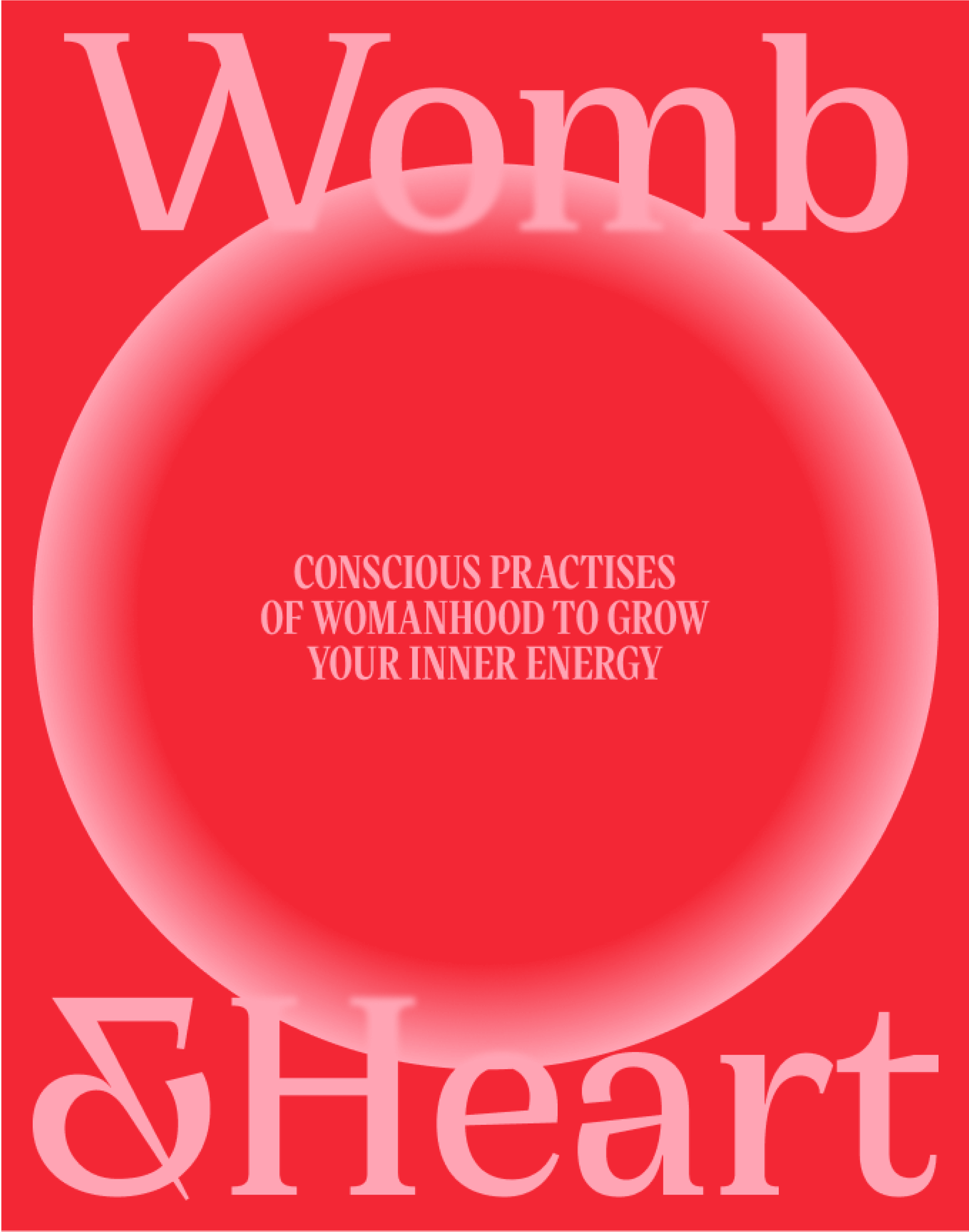
Womanhood unfluffed - A new era of unapologetic femininity.
Merging ancestral wisdom with modern science.
ROSENMOND
2023

Let’s bring HEART and FUN back into business.
Kristina & Tuan,
The Founders
Connect with us if you
want to be a digital icon.
want to establish a strong brand DNA.
value our technical expertise.
don't want to handle multiple agencies.


